
Quick Summary
If you sell prep for the USMLE, MCAT, NCLEX, COMLEX or any other high-stakes medical exam, your Facebook ad creative has one job. It has to make a stressed, time-poor student believe, in about two seconds, that you understand their exam better than the dozen other brands in their feed. The creative that tends to work best is rarely the glossiest. Short, human, instructor-led video does well. So do honest study-life content, simple static images with one clear promise, and carousels that make a complicated course feel easy to understand. Proof, such as real student stories and a clear look inside the product, should do the convincing instead of big claims. Creative also has to change with the exam calendar, because a student in week two of a dedicated study period needs a different message from one still weighing whether to start. Below, I’ll walk through what each format does, where it fits in the buying journey, how to keep it compliant and credible, and how to test it without wasting budget.
Why Facebook Feels Different for Medical Test Prep Buyers
Start with where your audience is when your ad appears. On Google, a student typing “best Step 1 question bank” is already shopping. On Facebook and Instagram, that same student is doing something else entirely. They are procrastinating between practice blocks, scrolling in a hospital break room, or half-watching something while their brain recovers from forty questions on renal physiology.
That changes everything about creativity. Search ads answer a question the person already asked. Social ads have to interrupt, and they have to do it respectfully, because your viewer is tired and has real pressure on them. A medical student or a nursing graduate isn’t browsing for fun. A single exam can shape a residency match, a licence date, or a first salary. So the emotional temperature of your audience is high even when the scroll looks casual.
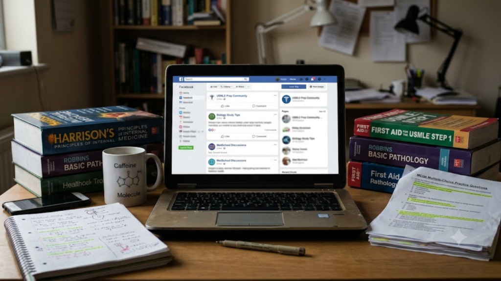
The mistake many test prep companies make is treating Facebook like a billboard. They post a stock photo of a smiling person in a white coat, add “Ace your exam,” and wonder why the cost per lead climbs. Those images blend into the feed because every competitor uses them. What stops a thumb is something that feels specific, like a real voice, a real screen, a real problem named plainly.
Meta’s own delivery system also rewards creativity that people engage with. Better creativity lowers the price you pay to reach the same person, which is why this isn’t only a design question. It’s a budget question. The right ad format can be the difference between a campaign that scales and one that stalls after two weeks.
Instructor-Led Video Is the Closest Thing to a Reliable Winner
If I had to pick one format for a medical test prep brand to test first, it would be a short video featuring an actual instructor or course creator looking into the camera. The reason is simple. Students aren’t buying content so much as a guide. Someone who has taught this material, knows where students stumble, and can say so in a calm voice is a powerful signal.
The strongest versions of these videos don’t try to teach a whole lesson. They open with a pointed observation, something like a common mistake students make when they review missed questions, and then give one useful idea in under forty seconds. That small piece of free value does two things. It proves the instructor knows the material, and it gives the viewer a reason to watch to the end instead of swiping away.
Production matters less than you’d expect. A clean frame, decent audio and good lighting are enough. In fact, overly polished video can work against you in this category, because it can look like a corporate promo rather than advice from someone who has actually taught the exam. Captions are nearly non-negotiable, since a large share of people watch with the sound off, especially in libraries and shared study spaces.
Keep the first three seconds ruthless. Put the hook in the opening line and on screen as text. Skip the logo animation and the long greeting. Your audience decides whether you’re worth their attention almost instantly, and a slow intro hands that decision to the next ad in the feed.
Study-Life Content That Feels Native to the Feed
The second format worth serious attention is what many marketers call user-generated style content. It looks like something a student might have posted on their own account. A hand-held clip of a desk covered in flashcards, a screen recording of a practice session, a short talk-to-camera about how someone restructured their study schedule after a rough practice score.
Why does this work so well for exam prep? Because test takers trust other test takers. They spend hours in forums and group chats comparing resources, and they’re skeptical of anything that sounds like a sales pitch. An ad that sounds like a peer sharing a method gets less resistance than one that sounds like a company describing itself.
There’s an important line here, though. Native-feeling content is not the same as fake content. Please don’t script a pretend student who “just discovered” your course. Audiences in this space are sharp, and a staged testimonial can damage trust faster than a weak ad can lose a click. Use real students, real tutors and real product screens, and let them speak in their own words, imperfections included.
A particularly useful variation is the screen recording. Show a student working through a question in your platform, with the explanation panel opening afterward. Narrate lightly. This gives prospective buyers something they badly want and rarely get, which is a look at what they’d actually be paying for. Many prep products hide behind a sales page, and a quick walkthrough in the ad itself can remove a lot of doubt before the click.
Static Images Still Earn Their Place When They Stay Simple
It’s fashionable to say video has replaced everything else, but static images remain valuable for medical test prep, especially for retargeting and for audiences who are already warm. The trick is restraint. A good static ad carries one idea, one promise and one next step.
Consider the difference between two approaches. One image crams a course logo, five feature bullets, a discount badge, a student photo and a button into a single square. The other shows a clean background, a short line of readable text such as a pointed question about a common study problem, and a restrained brand mark. The second one gets read. The first gets scrolled past.
Text on the image should be large enough to read on a phone held at arm’s length, because that’s how most of your audience will see it. Contrast matters too. A pale grey line on white is invisible in sunlight. And while it’s tempting to stuff every benefit into one frame, ask yourself what single thing this particular image should make a viewer feel. Relief? Curiosity? A sense of being understood? Build the picture around that.
Static creative is also the cheapest to produce, which makes it ideal for fast testing. You can try six headline angles in a single afternoon and learn which language resonates before investing in video. Many teams do the reverse, and they spend heavily on production before they know what message matters.
Carousels Are Quietly Excellent for Explaining a Course
Medical test prep products are complicated. There are question banks, video lectures, adaptive study plans, live sessions, score predictors, flashcard systems and often several pricing tiers. Explaining all of that in a single image or a thirty-second clip is hard. Carousels solve this nicely.
A carousel gives you room to walk someone through a mini story. The first card hooks them with a relatable problem. The next few cards show how your approach works, perhaps a glimpse of the dashboard, a sample explanation, a study schedule view. The final card invites a specific action. Because the viewer controls the pace by swiping, they’re doing a small bit of work, and that small commitment tends to make them more invested.
A few cards deserve special thought. The opening card decides whether anyone swipes at all, so treat it like a headline, not a title slide. The final card should make the next step feel low-risk, for example a free practice block, a sample lesson or a diagnostic quiz rather than a hard sell on a full course. Students are cautious with money and time, and a gentle entry point respects that.
Carousels also double as a quiet form of education. Even people who don’t convert may remember the framework you showed them, and that memory counts when they return weeks later ready to buy.
Matching Creative to Where the Student Is in Their Journey
Here’s where many accounts leak money. They run the same creative to everyone, from a first-year student casually exploring options to someone who visited the pricing page yesterday. Those two people need completely different messages.
For cold audiences, people who’ve never heard of you, creative people should lean on education and credibility. Think instructor tips, relatable study struggles and short demonstrations that earn attention without asking for anything big. The goal is to be remembered as the brand that actually helped, not the one that shouted loudest.
For warm audiences, such as people who watched a good portion of a video, visited your site or engaged with your page, creatives can start showing the product more directly. Feature walkthroughs, comparisons to the do-it-yourself approach, and student stories fit well here. These viewers already know who you are, so they need reasons to believe you’re the right choice.
For hot audiences, people who started a trial, added a plan to their cart or opened a checkout page and left, the creative should be short, specific and reassuring. Address the actual hesitation. It might be price, time, uncertainty about whether the course matches their exam format, or fear of making the wrong investment. A simple message about a trial, a refund policy or a quick chat with an advisor can bring those people back.
Think of it as a conversation that deepens. You wouldn’t propose on a first date, and you shouldn’t ask a cold viewer to buy a full prep package in their first interaction with your brand.
The Words Around the Creative Matter as Much as the Visual
Even the best video can underperform if the primary text and headline are weak. In this category, plain language wins. Students are reading in stolen moments and don’t want to decode clever wordplay.
Lead with the situation your audience recognises. Something about the dread of repeating the same missed questions, or the confusion of not knowing which topics to prioritise with six weeks left, reads as empathy rather than selling. Then connect that situation to what you offer in a sentence or two. Finally, make the next step obvious.
Be careful with phrasing that implies you know something personal about the viewer. Meta’s advertising rules restrict copy that asserts or implies knowledge of a person’s characteristics, struggles or circumstances. A line like “Are you failing your exam?” can cross that boundary, while a more general phrasing about common study challenges does not. It’s a small tweak with real consequences, since ads that violate policy can be rejected or can put your account at risk.
Also resist the urge to promise outcomes. Statements such as guaranteed passing or a specific score jump are risky from both a regulatory and a credibility standpoint, and no honest provider can control how an individual performs on exam day. Describe your method, your resources and the experience of real learners, and let prospective students draw their own conclusions.
Building Trust With Proof, Not Promises
Medical exam candidates are among the most analytical consumers you’ll ever advertise to. They’re trained to ask for evidence. So the creative that converts best usually contains some form of proof, delivered quietly.
Student stories are the obvious example, and they work when they’re specific. A testimonial that says “great course” does very little. One that describes how a student reorganised their weekly review, what they struggled with before, and how the explanations helped them understand a topic differently feels real. Always get permission, and be transparent about what the story represents. If you mention a score, make sure it’s accurate, current and clearly attributed, and avoid implying it’s typical.
Credentials matter as well. If your instructors are practising clinicians or experienced educators, say so, and show them. If your question bank was written and reviewed by specific experts, highlight that process. People are paying to borrow your expertise, so make the expertise visible.
One more thing about trademarks and affiliation. Exam names are part of how students search, but you should avoid anything that suggests your brand is endorsed by, or officially connected to, the organisation that administers the test. A small, plain disclaimer in the ad or on the landing page keeps you on the right side of that line and also signals honesty.
Testing Creative Without Burning Through Your Budget
Creative testing is where discipline pays off. The temptation is to launch twenty ads, watch which one gets the cheapest clicks, and declare a winner. But cheap clicks in medical test prep can be misleading. An attention-grabbing meme might pull a flood of curious scrollers who never intend to buy a course.
A better approach is to change one meaningful variable at a time. Test two different hooks on the same video, or two different opening images with the same message, so you can actually learn what caused the difference. Give each variation enough budget and time to collect a meaningful amount of data before you decide. Cutting an ad after a single day often means killing something that would have worked.
Look beyond the first click. Track how many people start a free trial, request a consultation, complete a diagnostic or purchase, and how much each of those actions costs. An ad with a higher click cost but a much better trial rate is often the more profitable one. Watching only the cheap metrics is how accounts end up with lots of traffic and few students.
Keep a simple record of what you tested and what you learned. Over a few months, patterns emerge, such as which instructors audiences respond to, which exam stages resonate, and which promises draw serious buyers. That library of insights becomes a real competitive advantage.
Planning Creative Around the Exam Calendar
Here’s an angle that doesn’t get enough attention. Test prep is intensely seasonal, and your creativity should move with the calendar rather than stay frozen.
Think about the emotional arc of an exam cycle. Early on, students are exploring and comparing, so educational and comparison creative fits. As the date approaches, urgency rises, and messages about structured study plans, final review and high-yield practice become more relevant. In the last stretch, people crave calm and confidence, so reassuring and focused creativity tends to land better than anything loud. After an exam, there’s a different audience entirely, those who need to retake or who are moving on to the next stage of training, and they need a message that respects what they’ve just been through.
Creative fatigue also hits faster than many advertisers expect. When your target audience is a defined, relatively small group of students and clinicians, they see the same ad repeatedly. Watch your frequency, and refresh creative before performance drops sharply. Often the cheapest refresh is simply a new opening hook on an existing video or a new first card on a carousel.
Plan ahead and you can produce a batch of content ahead of busy enrollment windows instead of scrambling when results dip.
Don’t Let a Great Ad Land on a Weak Page
You can have the best creative on the platform and still lose the sale if the click lands somewhere confusing. Message matches are critical. If your ad promises a free practice set, the landing page should lead with that practice set, not a generic homepage with six competing menus.
Speed matters, since most of your clicks come from phones. The page should load quickly, show the offer immediately, display proof near the top, and make the next step obvious. A long, complicated form is a quiet conversion killer, especially for someone who’s already mentally stretched. Ask for what you truly need and nothing more.
It also helps to keep the visual language consistent. When the instructor from your video appears again on the page, the viewer feels continuity, and that familiarity builds trust. That small detail can noticeably improve the experience.
Tracking should be set up properly before spending serious money. Make sure your pixel and conversion events record trial starts, sign-ups and purchases accurately, because Meta’s optimisation depends on that signal. Poor tracking means the platform optimises toward the wrong people.
Suggested Reading: How Medical Test Prep Academies Can Turn Facebook Leads Into Paid Enrollments
Conclusion
So what type of Facebook ad creative works for medical test prep companies? The honest answer is the kind that treats a stressed student like an intelligent adult. Instructor-led videos that offer a genuine tip, study-life content that feels like it came from a peer, clean static images with one clear promise, and carousels that make a complex course easy to grasp form a strong core. Wrap them in plain, compliant copy, back them with real proof, match them to the viewer’s stage and the exam calendar, and send people to a landing page that continues the same story. Test steadily, measure what happens after the click, and refresh before fatigue sets in. None of this requires a giant production budget. It requires empathy, consistency and the patience to learn from what your audience actually does.
If you’d rather not work all of this out through trial and error, Complete Gurus can help. They’re a performance marketing agency that runs Google Ads and Meta Ads for B2B, eCommerce and D2C brands, with a dedicated offering of digital marketing for medical test prep companies, plus Facebook and Instagram campaign management, landing page support, Medical SEO and a free Facebook Ads audit that shows where your current spend might be leaking. They also work with weekly reporting dashboards and a 90-day ROAS improvement guarantee on their terms. To see how they could support your next enrollment push, visit https://completegurus.com/.

Ashutosh Mishra is an AI Visibility & Performance Marketing Expert with 14+ years of experience helping businesses grow through AI Visibility (AEO/GEO), Google Ads, Meta Ads, and SEO. He partners with founders and business leaders to build data-driven growth strategies that increase visibility, improve marketing performance, and help businesses get discovered, trusted, and recommended in the age of AI.