

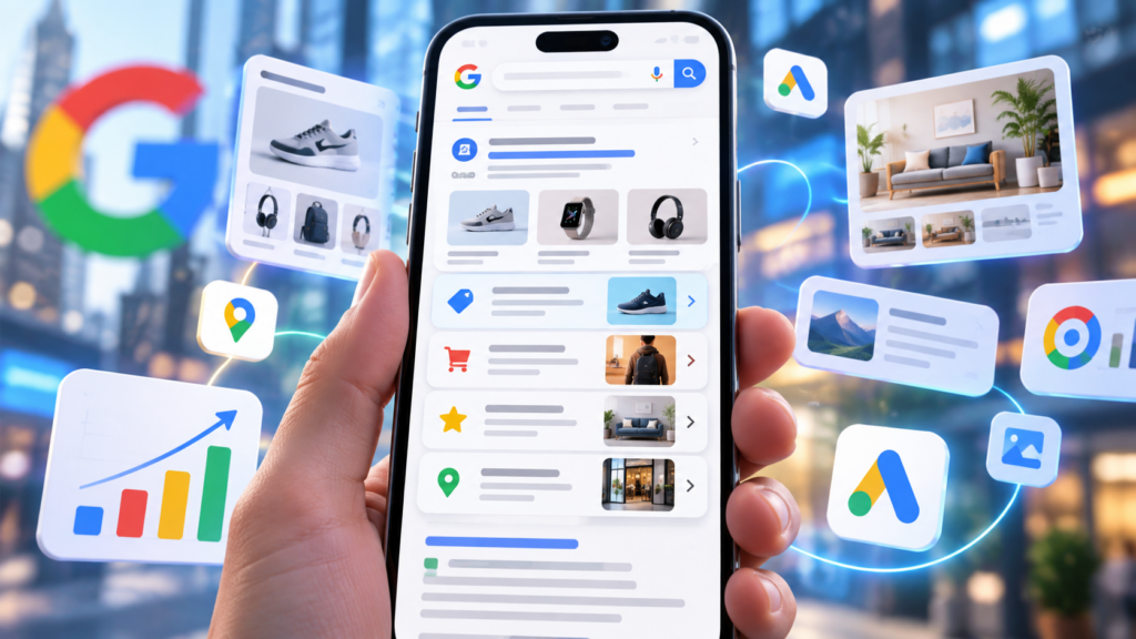
Google is once again playing around with how paid search results look on mobile. This time, it is testing a redesigned sitelink format. The new design makes each link easier to notice and gives text ads a stronger visual presence.
The test is another sign that Google Search ads are slowly moving away from the old block of headlines and descriptions. They are heading toward richer, more structured ad experiences.
The new mobile format was spotted in late September 2026. In the examples people have seen, the sitelinks appear in darker text and are lined up more clearly under the main ad, with a margin or line running down the left side. Some versions also show a small arrow next to each sitelink, and another version shows images alongside the links.
For advertisers, this might look like a tiny design change. But on a mobile screen, even a small layout change can make a big difference to how much attention an ad gets.
What Is Google Testing?
Sitelinks are extra links that can show up below a Google Search ad.
For example, a retailer advertising its main website might use sitelinks like:
- New Arrivals
- Men’s Products
- Women’s Products
- Sale
- Contact Us
These links help customers go straight to the section of the website that matters to them, instead of always landing on the same page.
Google has tested many sitelink designs over the years, and the latest mobile experiment gives these links a stronger visual structure.
One version that people have spotted includes:
- Darker sitelink text
- Links shown vertically
- A margin or visual line on the left
- Arrow icons next to individual links
Industry watchers have also reported other versions, including blue sitelinks and layouts where images sit beside the links.
The design seems to be aimed at making each destination easier to understand and easier to tap on a smartphone.
Why This Small Change Could Matter
Space is limited on mobile search.
On a desktop, several results can appear on the screen at the same time. A smartphone shows only a small amount of content before the user has to scroll. That makes every extra bit of ad space valuable.
If Google shows sitelinks as a bigger vertical list, especially with visual elements, a single search ad can take up much more of the screen. That could make the ad easier to notice. It could also push other paid and organic results further down the page.
This does not mean advertisers will automatically get more clicks. Right now, there is no evidence from the test that the new layout improves click-through rate.
Still, the design gives users clearer choices inside the ad itself. That is why advertisers should pay attention to how their sitelinks are set up.
Google Search Ads Are Becoming More Visual
This experiment fits into a bigger pattern.
Search advertising is no longer built only on plain text. Google has been adding visual and interactive elements across its ad system, including:
- Images
- Business information
- Product information
- Prices
- Promotions
- Ratings
- Location details
- Larger Local Services Ads
- Richer sitelink designs
Google is also testing larger Local Services Ads with more prominent images. That could give local advertisers more visual space in the search results.
Put together, all these changes suggest the search results page is turning into a more visual place. For users, that can make it easier to understand their options quickly. For advertisers, it means the quality of ad assets could matter more and more.
Sitelinks Could Become More Important
Many advertisers treat sitelinks as a side part of a Google Ads campaign. Most of their time goes into improving:
- Headlines
- Descriptions
- Keywords
- Bidding
- Landing pages
But if Google gives sitelinks a bigger and more visible look, the quality of those links starts to matter a lot more.
Imagine two advertisers showing up for the same search. The first one uses sitelinks like:
- Learn More
- Products
- Services
- Click Here
The second one uses:
- Shop Running Shoes
- Women’s Running Shoes
- Men’s Running Shoes
- Running Shoes Under $100
The second set gives users much clearer reasons to click. When each sitelink is visually separated, weak or repeated wording becomes far easier to spot.
Think of Sitelinks as Mini Calls to Action
A helpful way to look at the new design is to treat every sitelink like a small call to action.
Each link should have a clear purpose. Instead of repeating similar destinations, advertisers can use sitelinks to cover different things customers might want.
For an ecommerce company, that could be:
- Best Sellers
- New Arrivals
- Special Offers
- Shop by Category
For a service business:
- Request a Quote
- View Services
- Case Studies
- Contact Us
For a SaaS company:
- Book a Demo
- Pricing
- Features
- Customer Stories
The goal is to give users real choices. If sitelinks do end up being shown more prominently, this kind of structure can help people reach the right landing page faster.
Mobile Experience Matters Even More
What makes this test stand out is that it was seen on mobile.
Mobile users usually make decisions faster. They are working with a smaller screen, and they may be:
- Travelling
- Comparing products
- Looking for local services
- Checking prices
- Trying to finish something quickly
An ad that shows several useful destinations at a glance can cut down the number of steps someone has to take.
For example, a person searching for a local service may not want to open the homepage first. They may want to go straight to Pricing, or Book Appointment, or Call Now. A stronger sitelink display can make that journey much more direct.
Could the New Design Improve Click-Through Rate?
It is too early to say.
Google often experiments with search result layouts, and not every test becomes a permanent feature. What we know is that Google is testing this design. We do not know that it will roll out worldwide, and we do not know that it improves CTR.
Still, there are good reasons for advertisers to keep an eye on it. A bigger sitelink display could:
- Make the ad more visible
- Give users more clickable entry points
- Help people find the right pages faster
- Improve navigation straight from the search results page
- Take up more screen space overall
At the same time, there can be downsides. A bigger ad does not guarantee better performance. If the sitelinks are poorly written or lead to weak landing pages, extra visibility will not fix the real problem.
More Visual Ads Could Also Affect Organic Search
This test matters beyond PPC.
If paid listings become taller on mobile, organic results may slide further down the screen. This is already a big issue in modern search results, because a mobile results page can include:
- Paid ads
- Shopping results
- AI-generated experiences
- Local results
- Videos
- People Also Ask
- Organic listings
If ad formats keep growing vertically, marketers will need to think of the results page as one shared space for paid and organic visibility. That gives SEO and PPC teams one more reason to work together.
The real question may no longer be “Where do we rank organically?” It may increasingly be “How much visibility does our brand control across the whole search results page?”
What Google Ads Advertisers Should Do Now
There is no new setting that advertisers need to turn on for this test.
The format that has been spotted looks like a change in presentation that uses existing sitelink assets. It does not look like a brand new asset type in Google Ads. So advertisers should focus on the quality of the setup they already have.
A good review should check whether:
- Every important campaign has relevant sitelinks
- The sitelink text clearly explains where the link goes
- Several sitelinks are not pointing to almost identical pages
- Landing pages match what the sitelink promises
- Mobile landing pages load quickly
- Sitelinks reflect the main things customers are looking for
- Promotions and high-value pages are included where it makes sense
Advertisers should also track mobile performance separately. If Google expands this layout later, mobile CTR, conversion rate and sitelink-level engagement can give useful clues about the impact.
Google Keeps Experimenting With the Search Results Page
Google regularly tests different ways to show both paid and organic results. That means marketers should not assume every test they see will become permanent.
For now, the new sitelink design should be seen for exactly what it is: a test. The reports so far do not show that all advertisers are getting the new layout.
Even so, the experiment is worth watching because it points to a bigger trend. Search advertising is becoming more visual, more structured, and more focused on helping users make decisions right from the results page.
What This Means for Performance Marketers
For performance marketers, the lesson goes beyond sitelinks.
Google Ads optimization can no longer focus only on bids and keywords. Campaign performance depends more and more on the full experience:
Search Intent → Ad Creative → Assets → Landing Page → Conversion
A visually stronger sitelink may grab attention, but the whole journey still has to make sense. The best-performing advertisers will likely be the ones who treat every visible part of the ad as part of the path to conversion. That includes sitelinks.
Final Thoughts
Google’s latest mobile sitelink test may look like a simple design tweak, but it shows an important direction for search advertising.
Google Search is becoming more visual and more interactive. Text ads are getting richer elements. Users are being given more ways to move directly from the search results to what they want. And on mobile, where screen space is extremely valuable, a more prominent sitelink format could change how people notice and use ads.
For advertisers, the right move right now is not to redesign campaigns around an experiment. It is to make sure the basics are already strong:
- Clear sitelinks
- Relevant destinations
- Strong mobile landing pages
- Useful calls to action
- Careful performance tracking
If Google rolls out a bigger or more visual sitelink experience more widely, advertisers with well-built assets will already be ready for it.